As Lead Product Designer, I overhauled a complex, compliance-driven merchant application to improve conversion and efficiency. Streamlining multi-step workflows and simplifying regulatory requirements led to faster completion times, lower abandonment, and higher overall success rates. I owned the full discovery and design process, from research and analysis to stakeholder alignment, experience mapping, and final design execution.


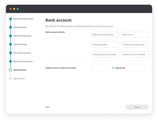
This project zoomed in on the first stretch of the merchant journey: the path from signing up to finally hitting “submit” on the business application. It sounds simple, but in reality this was where we were losing the most merchants. The flow was long, compliance-heavy, and left users feeling underprepared and overwhelmed.
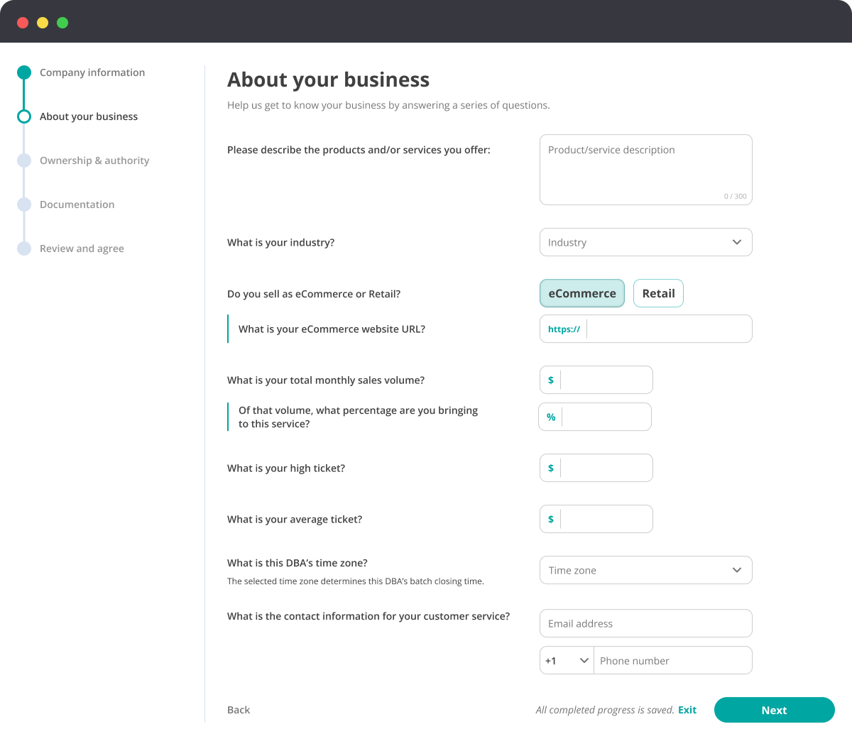

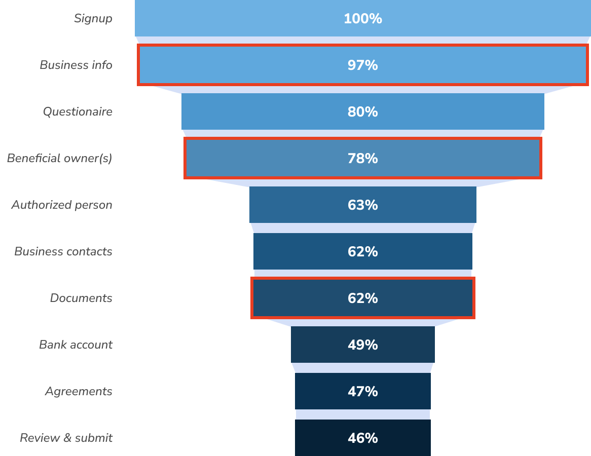
Our analytics tools surfaced a critical problem: a large percentage of merchants were abandoning the application midway through. The challenge was to redesign this complex, compliance-heavy workflow in a way that improved completion rates and time-to-complete, while maintaining the rigor required for high-risk payment processing
To guide the redesign, I defined a clear objective and identified key success metrics to measure impact and validate outcomes. These metrics became the foundation for evaluating whether our design changes were truly improving the experience.

Designing this flow wasn’t just about making things “simpler.” There were complex considerations I had to take into account, and some necessary requirements and I had to work within.
Before diving into design, I conducted user research and data analysis to uncover where merchants struggled most in the application process and why abandonment was occurring.

To understand how merchants were interacting with the application, I analyzed quantitative data such as funnel drop-off points, field-level error rates, and average time-to-complete across each step of the flow.
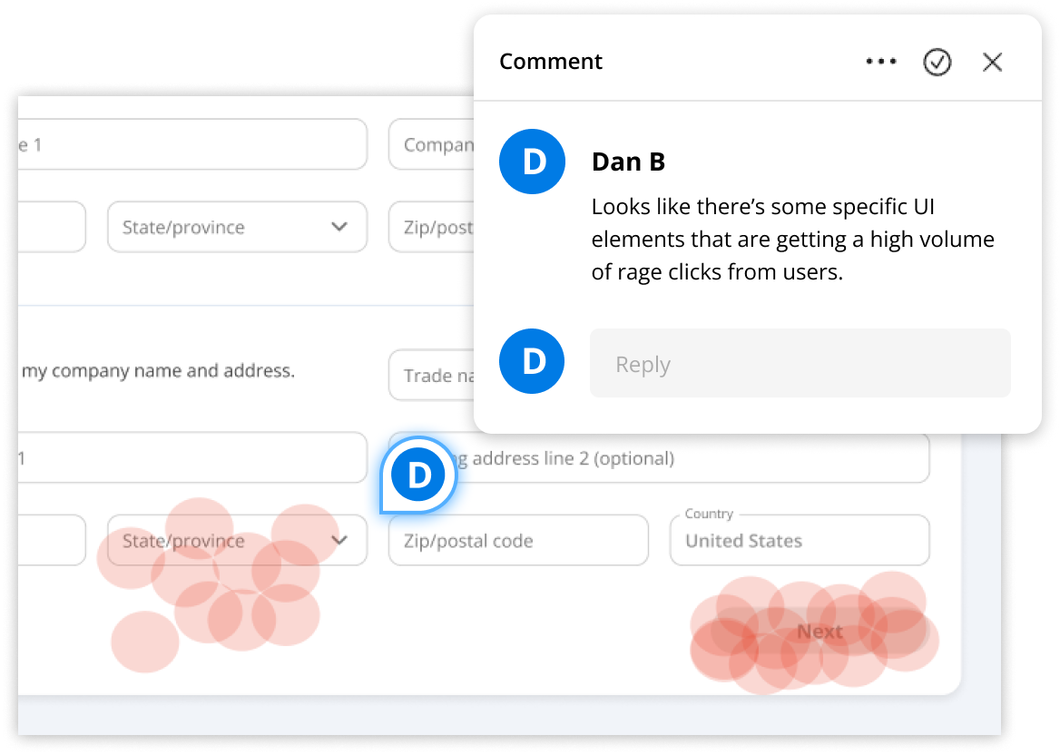
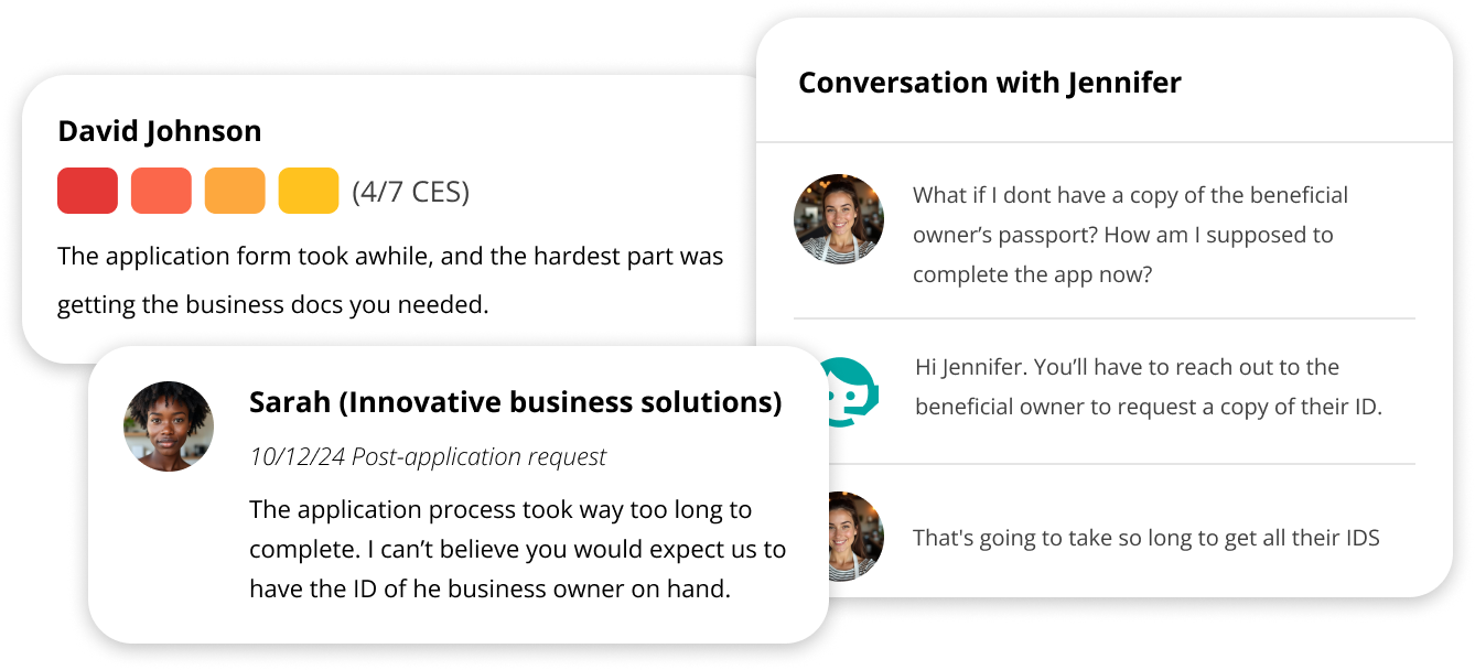
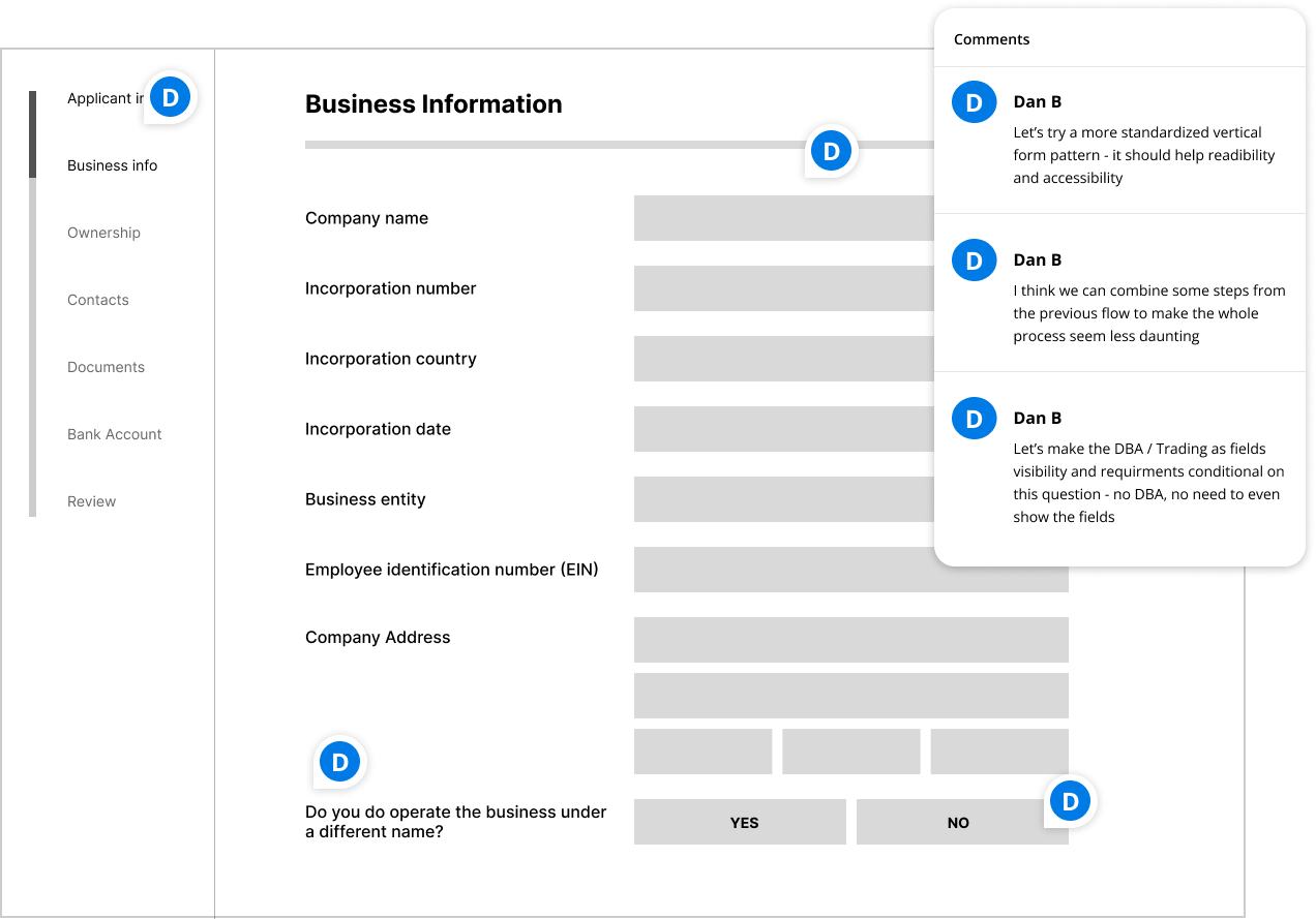
To complement the analytics, I gathered qualitative insights by reviewing merchant feedback, Customer Effort Score (CES) comments, and support queries to identify pain points in language, flow, and overall usability
In addition to merchant insights, I conducted interviews with internal stakeholders who regularly touched the application, including compliance, risk, underwriting, and support teams. These sessions helped surface where they saw deficiencies in the current workflow, what improvements could make their jobs easier, and how proposed changes might impact their processes downstream.
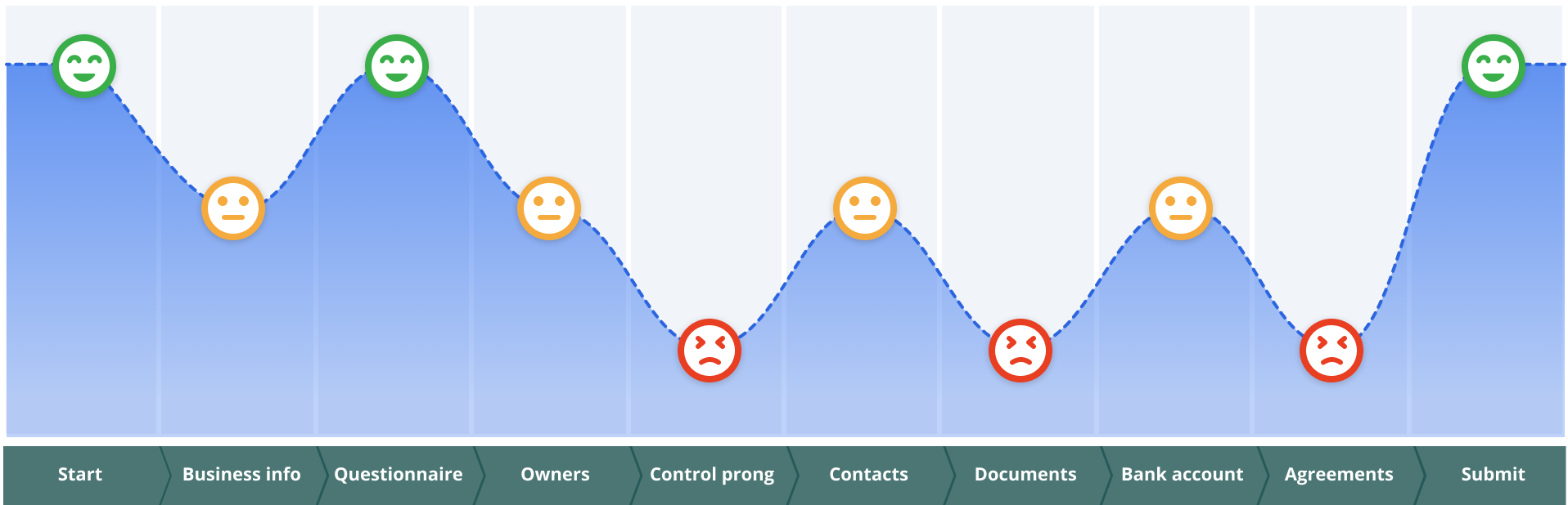
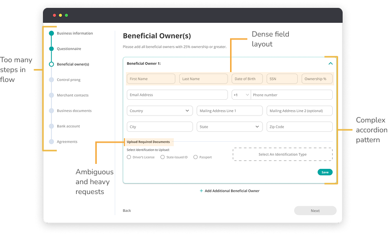
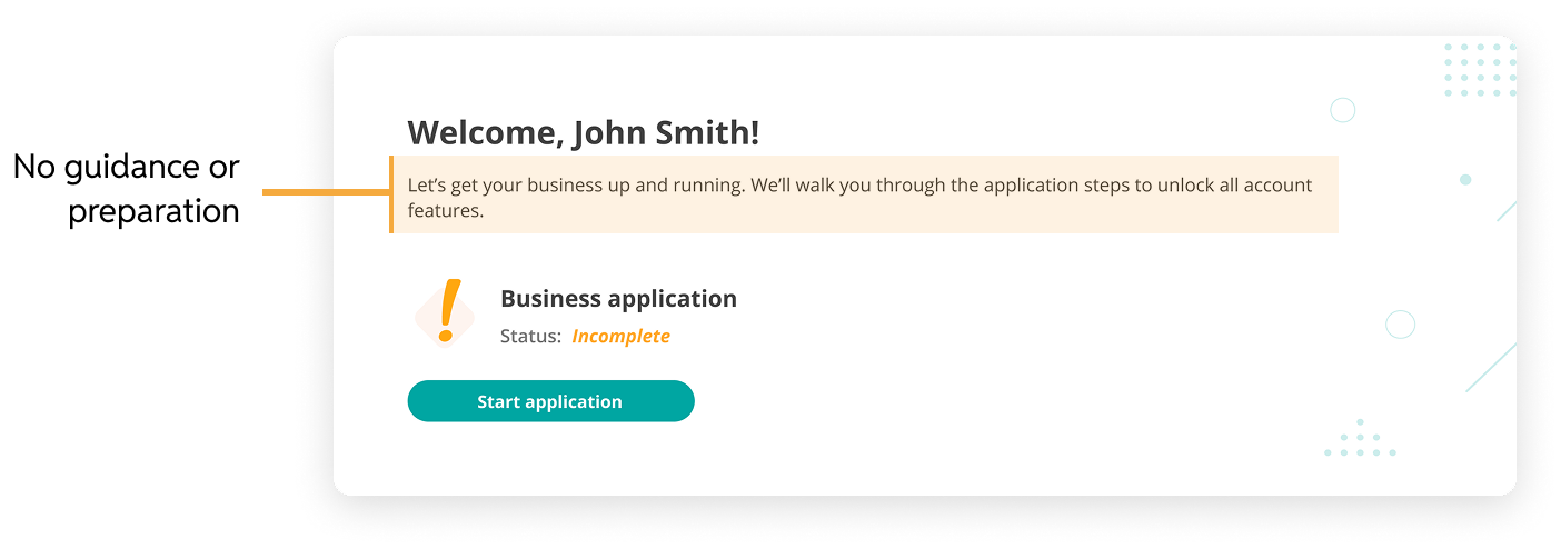
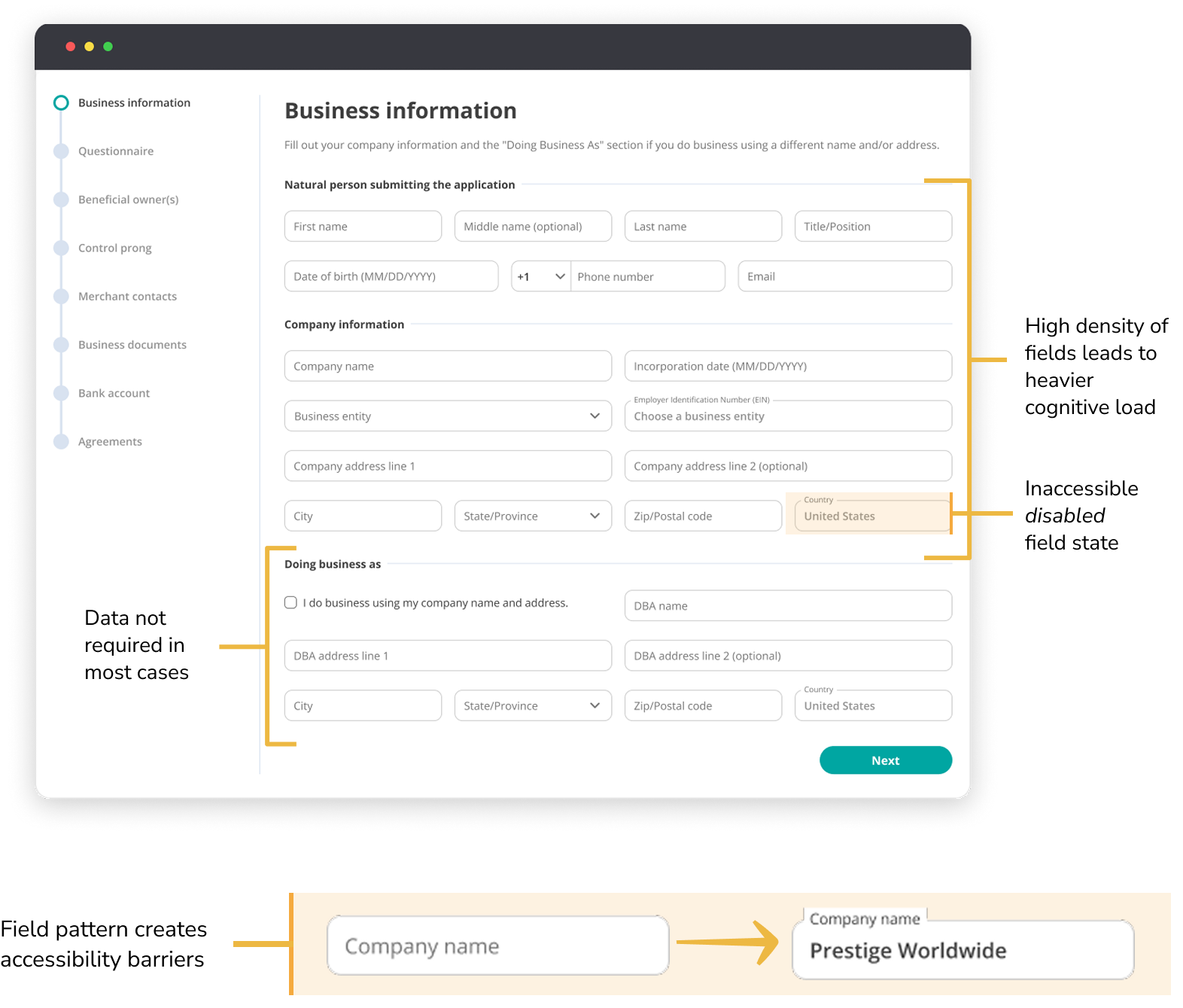
From the discovery work, four key pain points stood out in the merchant application. These findings highlighted the biggest sources of friction that were preventing merchants from completing the application successfully.

To better understand where merchants struggled, I mapped the customer journey across each stage of the application. By combining analytics data with qualitative inputs like feedback, CES comments, and support queries, I was able to pinpoint the exact stages where friction occurred and build a clearer picture of the end-to-end experience.
With the main pain points identified, I began rapidly wireframing different approaches to the application. This allowed me to test new form patterns, try out simplified flows, and get early feedback before investing in high-fidelity designs. Wireframes gave us a fast way to iterate, visualize solutions, and validate which ideas reduced friction for merchants.
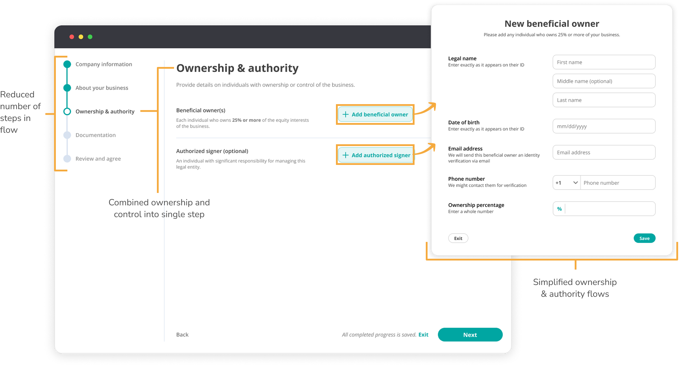
The wireframes that performed best in testing became the foundation for the final design solutions.
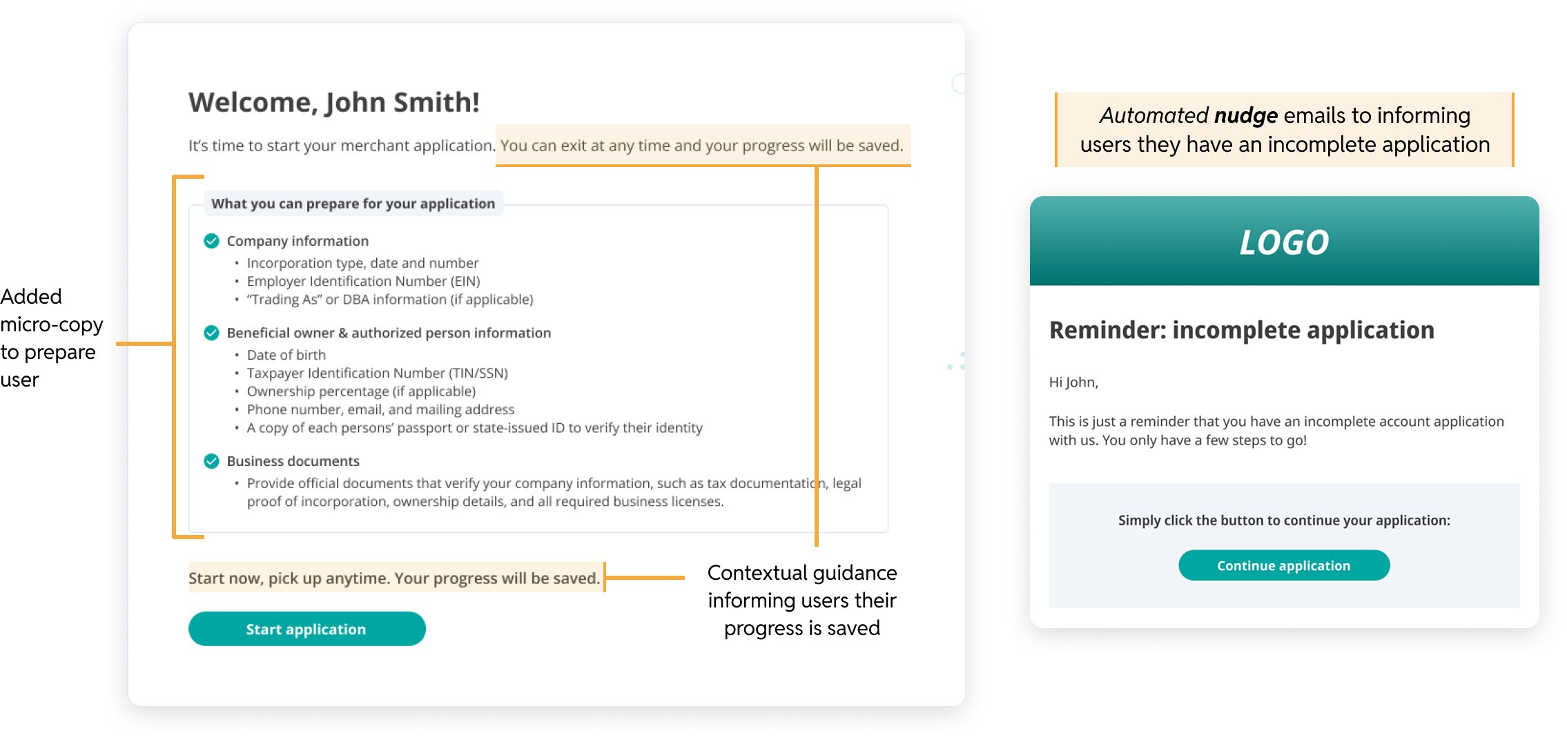
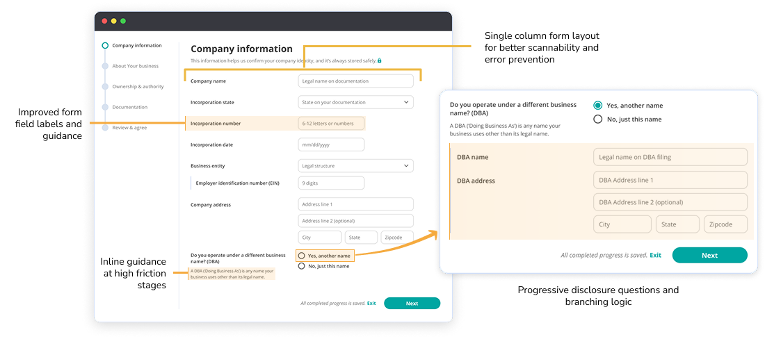
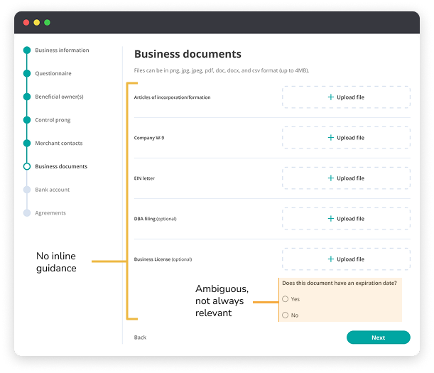
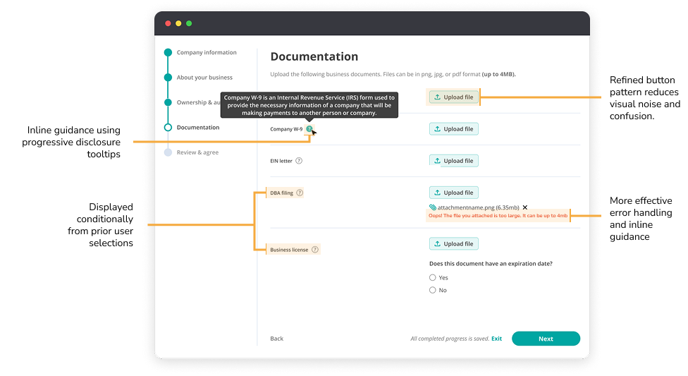
With the four main pain points identified, I focused on addressing each one directly through targeted design changes: simplifying the flow, creating guardrails to reduce abandonment, introducing consistent form patterns, and reducing the support burden through clearer guidance.


No redesign comes without its hurdles. Along the way, I ran into a few challenges that tested both the design and collaboration process, from navigating compliance limitations to balancing scope with user needs. The next two examples dive into the toughest moments and how I worked through them.

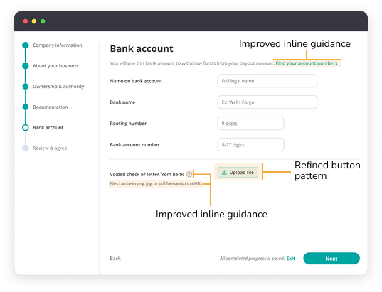
The redesign led to measurable improvements across key engagement and completion metrics. By simplifying the flow, clarifying content, and improving form interactions, we saw faster submission times, fewer drop-offs, and a higher overall completion rate.

The redesign led to measurable improvements across key engagement and completion metrics. By simplifying the flow, clarifying content, and improving form interactions, we saw faster submission times, fewer drop-offs, and a higher overall completion rate.


The redesign didn’t just improve the application, it also shaped how future products would be built. The work established scalable patterns, strengthened cross-team collaboration, and influenced roadmap decisions that extended beyond this single flow.